First Study of Series Two -24th November

Today I began a new series of paintings, which are based around my cousin’s image. As I said initially in the planning of my work, I wanted to create series of paintings, which are all related. In this series, I would say that my painting style looks illustrative and for once, I am fairly happy with what i’ve done so far.

As you can see, I have documented the process of my painting, so that if i go wrong, i can see where I made my mistakes.

 I decided to add a complimentary blue background, which usually looks good with the tones of colours, which I chose to use for the skin colours. Below is the finished piece, along with some close-ups of the detail.

I might decide to go on and take this painting onto illustrator and add more effects onto the image as a sort of experimentation.

img_0271


Photograms- LCC

During my trip to London, I got the opportunity to create a series of phortograms, as part of the workshop involved with the tour around LCC. I really liked LCC, and am quite pleased with the outcome of my photgrams, which I have been given back since the trip.


Unit 5 Research Continued- 3rd November

On Thursday, I continued working on a mood board, which I am going to be presenting next week to my pathway group. I came across an interesting photo by John Deakin on the left, which I think might work well in the form of a painting.

I also came across a really interesting portrait of Mick Jagger on the right, by David Bailey. I feel like this idea could work well if I was to take some really intimate, close- up pictures of different people, before going on to create some oil paintings.

image
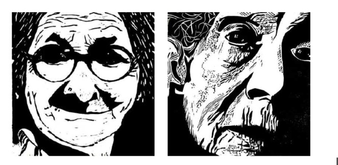
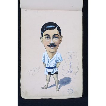
I was also drawn to this caricature, by George Cooke as I liked how the artist had decided to add a tiny body, which adds more humour to the piece.

After some thought, I decided that I would go back to the original portrait photo’s by Saulty Maude, which I discovered and go on to look for some more artists, who are well- known for taking flamboyant images of people holding props.I came across this illuastration, which strongly reminded me of Saulty Maude’s photo, as you can see below.

I am interested in looking at distortion and I became quite excited, when I saw this picece of work below,by John Cheever called The Swimmer. I might try and cut up different images, then go on to create a painting in a similar sort of style.  I like the idea of bringing different images together to create a different outlook on what the face represents.

image

UCAS and Tonal Drawing- 17th October

In the morning, we set up our UCAS, for when we apply for uni, then we went up to the FAD room to continue with our work where I decided that I would do a tonal drawing of myself, from the 10×8 photos we took from Friday. After looking at my portrait, I automatically looked at the flaws in my appearance and at my worst points, and that’s when I came to a realisation that the fragility of people in Blackburn on a daily basis is of just an equal measure. Everyone I looked at seemed and appeared to have some sort of fragility or weakness; whether it was addiction, illness, age etc. In my opinion, weakness is a strength because if we were all perfect then it would be boring and there would be no diversity in anything.

As I studied Blackburn more thoroughly, I visually saw the landscape fighting the people, who were contrasting to eachother; the strong stature of the buildings and the man, dwarfed by the artificial elements. As you can see below, I have recorded the process of my drawing so far and I hope to finish it soon and add contrast to the background.


Slab Pots and 10×8 Camera- 13th October

We were given some inspiration from a Pintrest board, which Kim and Jo had put together, before we continued to roll out our slabs into a pot. As you can see in the images below; the finished result from my first attempt at creating a slab pot. Overall, I am happy with this piece however I did think that if I was to make another, it would need to look more cleaner -cut.

After finishing my slab pot, which is set to be fired in the kiln, we went to the photography room, where we learnt about the setup of a 10×8 camera, before having a go at capturing some portraits.

To capture the perfect image, we had to get the light intensity right so that the image would show up properly, when we developed it. Shaun decided that we should use two spotlights, positioned at either side of the camera. After some experimentation, we found that the best exposure time was eight seconds.

image

Above;: Nathan is positioned on the stool and Shaun is focusing the Camera for when he opens the lens for the light to hit the paper.

After we had opened the lens to let the light into the camera, we took the photos to the dark room, where we put them into a developing solution for three minutes before putting the image into a different type of developer for one minute. After the image had fully developed, we took the image and put it into the fixer for five minutes, so that when it is released into the light, it wouldn’t react with the light and alter in colour. As you can see above, Lauren and myself had a go at creating a double exposure image, which turned out pretty well for a first attempt.

I personally really enjoyed the 10×8 workshop so much that I decided to come back the day after to carry out the workshop again and try and capture some more double exposure images, as I thought they looked really interesting.

Link to Pintrest Board

Developmental Studies – 29th September 

On the 29th of September, we got the chance to catch up with some work and so I decided to stitch onto a monoprint, which I created the week prior. As you can see, it is fairly abstract and I liked the idea that the original photograph, which I took had been transformed into a visually brighter and more jubilant piece.

thumbnail_image1


‘Never Let Me Go’- 21st September

We went to the screening room to watch a film called “Never Let Me Go”. Below is a quick overview of what the film entails:

Never Let Me Go is set in a dystopian world in which human clones are created so that they can donate their organs as young adults. The novel follows the life story of Kathy, a clone who is raised at a boarding school for future “donors.”

After watching the film, i decided to have a look at some of the film posters, which were used to advertise the film back in 2010. I personally really liked the images, which were used, but more importantly, I loved the way in which the director (Mark Romanek) chose to film the movie as a whole.

I must admit that i was not to keen on the ending of the story due to it concluding on a some-what depressing ‘note’, however I liked the concept of the truth, as it slowly unravels to the audience as well as the character’s in the film. Below I have captured some shots of certain scenes, which I found to be interesting.

never-let-me-go-16never-let-me-go-banner-piernever-let-me-go-film-castnever-let-me-go-lb-1


Confessions Video- 22nd September

On Thursday, we all met in the FAD room, where Jamie informed us that we would be taking part in a group collaboration, which would involve making a confession on camera. Jamie informed us of Gillian Wearing; a famous artist, who is most commonly known for her videos, which involve everyday people fessing up to things, which they have never before revealed and so, we were going inevitably creating something based on the work of another artist.

After we had been given some time to have a think about what we wanted to confess on camera, we all made our way over to the film studio in the University Centre and were informed of the different tasks, which would be carried out as a group, in order to complete the project by the end of the day.

image1

As you can see in the image above, a stool had been positioned towards the front of the studio in the line of where the cameras had been set. The lighting had to be adjusted to the right intensity in order to set the right atmosphere to fit the subject matter. I had a go at every task we had been set; moving and positioning the camera, directing what was going on the set and making sure the sound was ok.

For me, I must admit that getting up in front of the whole group to make a confession, was pretty daunting however I pushed myself to do it as I want to gain more confidence and take on new challenges.

The confessions video will be posted shortly.

Roundabouts (TEXTILES)- 20th September

On Tuesday, we started by Cyanotype printing, which meant that a solution had been set up for us with water, ferric sulphate and ferricynide, which becomes immediately UV light sensitive when mixed. The cloth and paper, which we used had been previously soaked in the solution in a dark room.

As you can see in the picture above, we placed our photo and sketches onto the light machine, which had been printed out onto Acetate. For the first experiment, we used paper to create our cyanotype and i decided to experiment with a photograph and as you can see it turned out quite well.


I also decided to incorporate one of my sketches into a cyanotype; the lines did not appear to be so vivid as when i did the photograph, however I liked the effect it gave. After we had developed some cyanotypes, we began to create some screen prints and below i have captured the process of what we did.

After we created the screen prints, we went onto the sewing machines and got to develop our work further. I took the acetate, which we used to make the cyanotype print, and then sewed onto it. Below, you can see the development, which i made; I am sure that i will go on to create some more combinations of fine art mixed with textiles, as i really enjoyed sewing and learning how to work the sewing machine properly.


Lino Printing  – 19th of September

In the morning, we were given a piece of linoleum and a v-shaped chisel, and then instructed to gouge into the material, using a photo or sketch as reference. I decided that I would use the photo, which can be seen below, as i felt it had plenty of detail and really captured the idea of ‘documenting the day’. It took some time getting “the hang” of cutting into the linoleum, but once I fathomed the technique, I began to really enjoy what I was doing.

img_0090

After some time, I decided that I would create some prints with my lino drawing to get an idea of what it would look like and then decide whether any more detail could be added in order for improvement. As you can see below, the lino prints turned out very well, although I plan to add more detail and will be posting the final results, when I have had the chance to spend more time on it.

img_4643

img_4641

After making my Lino print, i decided that I would carry out some research into some contemporary artist’s , who are known for Lino prints, and I came across a man called Justin Kramer, who has made some interesting pieces. From looking at these Lino drawings, I would like to make some Lino Portraits myself, as well as adding more detail to my current Lino.

image